
Composition
Composition is the placement or arrangement of elements on a picture plane. Plan your composition before you paint. If you are replicating a photo, it is already composed for you. If you are working from life, you'll want to one or more studies before starting your painting. The following steps are for your first fruit painting. Painting to the left by Red Dot student Lisa Himic.

Draw rectangles
Start your studies (or thumbnail sketches) by drawing four rectangles, filling up your page.

Proportions
Be sure your rectangles are the same proportion (width to height) as the canvas or other surface you will be painting on. You can eyeball it.

Don'ts
1. No tiny subject centered in the middle 2. No tangents: objects touching. Overlap or separate them. 3. Don't cram the space like it's a box to be filled. 4. Don't place objects sitting on the bottom like it's a surface.

1. Triangle
The most common composition in still life is the triangle. Heavy on bottom, light on top, it won't tip over so it makes us feel safe and warm and fuzzy. It can be a traditional, conventional composition.

Negative Space
Your figure (the fruit) is positive space; your background (stripes) is negative space. You want an interesting relationship between the two. This is called your figure/ground relationship. In this case, since our cast shadows are so prominent, they can become a part of the positive space. We will use them as such in the next drawing.

2. Shadow as subject
Move your lamp and fruit around, and instead of concentrating on the fruit, consider the shadows to be your focus.

3. Close-up
Crop your objects tightly for a close-up. We will not use this composition for our painting because you won't get as many learning opportunities, but you'll get practice at a great way to compose. When painting, close-ups are good for capturing texture and details.

4. Random
Try an unusual grouping for the fourth composition. Be sure to make it different from the other studies.

Re-crop
Move your outside boundary around to improve the composition if necessary. The image here would look better if changed to a portrait orientation.

Examples
Read about the successes and mistakes of the following student (and teacher) examples. Each of the compositions to the left are good. The cast-shadow image breaks some rules of balance, but is still interesting and daring.
Reach out
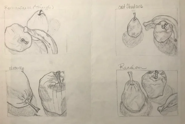
Each of these compositions reaches outside the picture plane. They are all good except for the triangle, which has tangents at the top of the pear and close to the apple. The banana looks like it's floating. The cast shadow image is best.

More negative space
Each of these compositions is interesting and thoughtful. The artist could have perhaps tried the fruit in different sizes for variety. They also could have experimented with more negative space.

Variety
Here is a good example of variety of sizes of subject. The random one has a tangent at the bottom, and could be re-cropped to include more space below the arrangement.

All good
Each of these compositions is balanced and well-cropped. The random one is a bit unusual, but in a good way.

Loose style
Although non of these compositions are very good, this artist shows a freedom with their style, which is good. Draw as simply or tidily as you like.

Mistakes
Not all of your sketches will necessarily be good. That's why we try four. Each of these studies would be better if cropped. Note that the close-up is a square, and would not translate to a rectangle canvas.

Yes and no
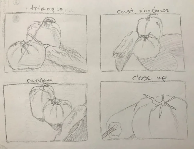
The top two sketches are very straightforward. Not bad, but not exciting. The close-up is the no-no in which everything is crammed in a box. The cast shadow image makes great use of its negative space.
Rule breakers
The triangle shows the no-no where the arrangement sits right at the bottom. The cast-shadow sketch is small and centered, but the shadows break up the negative space well. The close-up is like a landscape, which is fine. The random breaks a lot of rules AND makes an unusual, rebellious, fun use of space. It's OK to break rules AFTER you learn how to follow them.